Atlas Digital Emailer

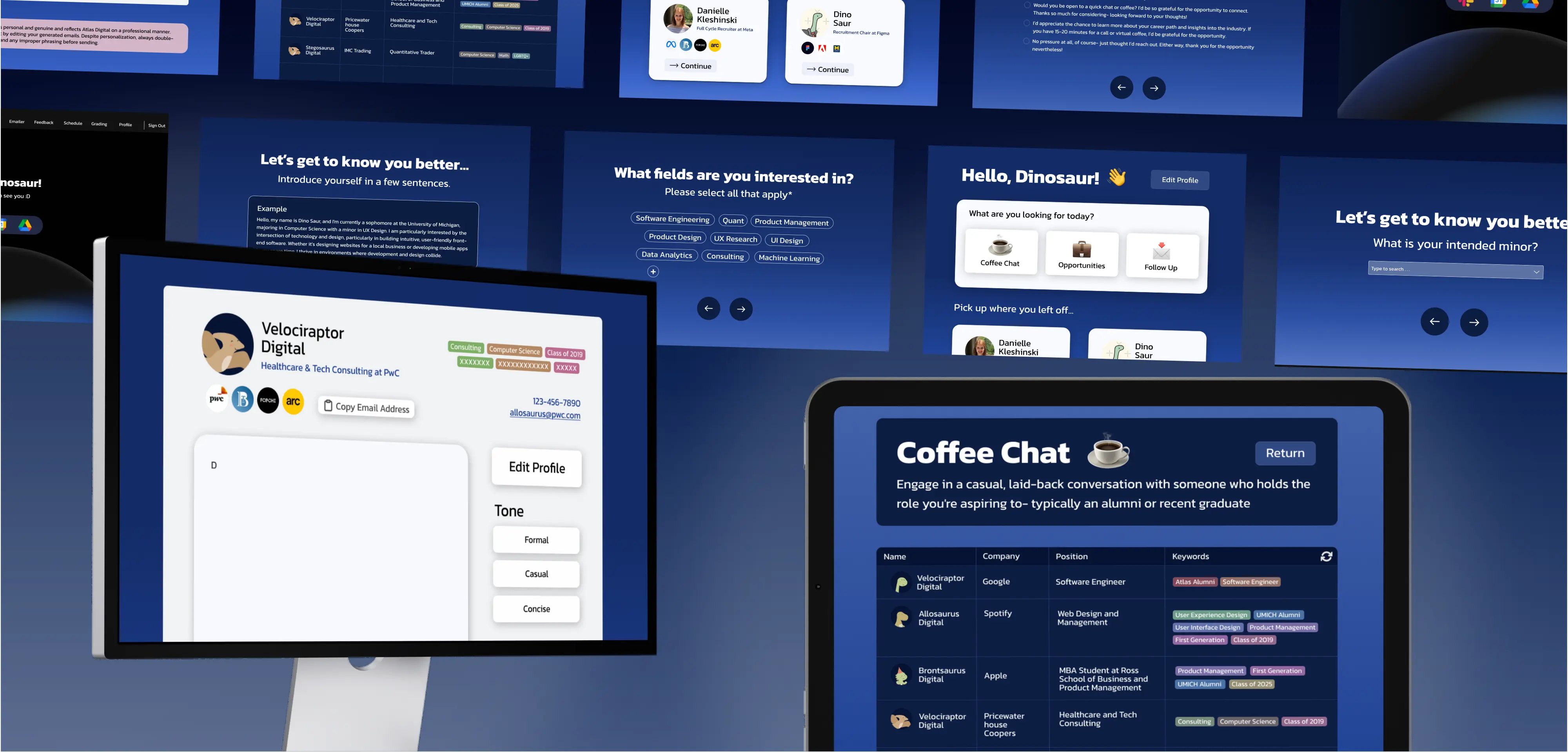
An AI-powered email generation assistant tool designed for members of a technology consulting club

Role

UX Designer


Timeline

5 Months


Team

1 Project Manager

5 Software Analysts

1 UX Designer

Platforms

Figma

Procreate

React

Firebase

BACKGROUND

The Why

Today, recruiting success comes from genuine relationships and personalized outreach- not just submitting applications. In our club, many talented members were spending hours on LinkedIn or sending generic emails with little response. The real problem was visibility. We needed a system to help them find recruiters faster, personalize outreach, and turn applications into conversations.


RESEARCH

Competitive Analysis


I created a competitive analysis to position the Atlas Emailer as a potential software product, comparing it to tools our club members might otherwise use. I wanted to visualize before the platform was built, how to frame it as a fully realized product.


The Atlas Emailer combines features that other platforms separate. Unlike Simplify, it automatically retrieves and stores recruiter emails in an internal database, cutting long-term costs. Unlike Apollo.io, it doesn’t rely on expensive API calls or pay-per-search fees. And unlike both, it generates fully personalized, GPT-powered emails instead of generic templates. Our goal is to build a more sustainable, cost-efficient, and personalized outreach tool than existing alternatives.

As an internal consulting project for Atlas Digital, we studied our own members as the primary users. We interviewed 8 interns and software analysts, surveyed 20 members, and combined qualitative feedback with survey data to understand their challenges.


To validate our observations, we drew on Drawing on Closing the Doors of Opportunity (Hora et al., 2022), we found our members faced similar barriers: limited internship availability, heavy course loads, and the need to work paid jobs. Many spent hours searching for recruiter contacts, reused generic email templates, and had no centralized place to store or share information-making outreach repetitive, and discouraging.


Key Insights:


  • No efficient system to find and connect with recruiters

  • More than 75% interviewed reused generic templates, reducing personalization

  • Nearly all wanted a shared contact database to avoid duplicated work

  • Time and energy spent securing internships was too high

RESEARCH

Understanding Users

SYNTHESIS

User Persona

Rebecca Sun

Club Member in Atlas Digital Consulting Club

Computer Science

Class of 2028

Rebecca is a student preparing for the internship cycle, balancing course load, extracurriculars, and applications. Despite her qualifications, she feels behind.


PAIN POINTS

  • Spent excessive time digging in LinkedIn or Slack to find recruiter contacts.

  • Lacks the confidence to write personalized outreach emails and defaults to using generic templates.

  • Frustrated by effort- realizes others in the club may have already contacted the same recruiter but there’s no way to know.

SYNTHESIS

Problem Statement

Atlas Digital members don’t have one place to connect with recruiters in a reliable way. Right now the process is scattered, and that makes it easy for talented students to get overlooked in the job market.

IDEATION

Low-Fidelity Storyboard

My low-fidelity storyboard outlines the full user flow of the recruiter outreach platform within the Atlas Digital portal, prioritizing functionality. Members begin on the site, connect their email, and input profile details and industry keywords (like product, consulting, or software engineering).


Filters such as programs or shared identity groups surface relevant recruiters with stronger connection potential. When a recruiter is selected, GPT generates a personalized outreach email using both recruiter data and the member’s profile. Members can edit, attach their resume, and send directly. Future features include resume scoring and automated follow-up workflows for coffee chats or re-engagement after applying.

IDEATION

Design System

IDEATION

Inspiration

When designing our recruiter outreach platform, we looked to established tools for interface and workflow inspiration to ensure our product felt intuitive.

Simplify’s dashboard influenced how we approached our member homepage. We admired how Simplify presents users with a clean, centralized layout and large, action-oriented cards for key tasks. In our platform, this translated into a streamlined dashboard where members can instantly choose between core actions- Coffee Chat, Opportunities, and Follow-Up- without hunting through menus.

QuillBot’s AI writing dashboard inspired our email generation interface. Its integration of writing tools, tone adjustments, and content purpose toggles directly informed how we built the recruiter profile view. Members can view a recruiter’s information and, within the same screen, customize outreach tone (formal, casual, concise) and purpose (introduction, follow-up, application) before sending- mirroring the experience we saw in QuillBot.


ITERATION

Testing

During our iteration phase, I met one of my mentors- a senior member in the UX Design program and also member of Atlas Digital with significantly more experience- to review the interface. She provided targeted feedback on design consistency, accessibility, and usability. Specifically, issues with spacing alignment, button contrast, and the rigidity of forcing users to choose from preset templates. Her guidance helped me refine the visual hierarchy, and improve accessibility through higher-contrast elements.


We prototyped the email creation interface in Figma and tested it with club members and our software engineering team. UX interviews and usability tests revealed three main issues:


  1. Cognitive Overload Too much recruiter and profile information crowded the screen, making editing harder. Especially the various color coding of red and blue made information confusing.

  2. Unclear Workflow Personalization, tone, and purpose controls felt scattered and confusing.

  3. Poor Space Use – The large recruiter profile pushed the email body too far down, reducing focus.


The redesign simplified the layout, grouped controls logically, and prioritized the email body, making personalization faster and the interface easier to navigate.

ITERATION

Changes

These onboarding screens represent a core improvement we made after our midpoint feedback- placing personalization at the center of the outreach process. Instead of relying on a few static templates, we now begin by gathering detailed, relevant information about each member: their major, minor, fields of interest, and aspects of their personal identity they wish to highlight.


This approach helps to ensure that the emails generated are tailored to the individual’s background, goals, and shared connections with the recruiter. By understanding each member uniquely, the system can surface more relevant recruiter matches and craft messaging that feels authentic.

These following screens further strengthen our focus on personalization by capturing each member’s unique voice. Members introduce themselves in their own words. Then, they select a writing style that best matches their tone. This ensures that the AI-generated emails reflect not only their background and interests but also their authentic communication style, making their outreach feel natural.

FINAL PRODUCT

Prototyping

This was my first major project that required extensive prototyping, and it quickly became a pivotal skill in bringing our vision to life. As we approached our final deliverables, the software engineers on our team were focused on backend integration and didn’t have the bandwidth to translate our UI into code before the presentation.


To ensure the experience was still presentable, I took the initiative to fully prototype the interface in Figma. In the process, I deepened my understanding of key interactive elements- such as radio button logic for user selections, hover states to create clear feedback on clickable elements, and even typing animations to simulate the dynamic feel of filling out information in real time.

On the top is the interaction panel for the text animation I developed to simulate a “typing” chatbot effect in the prototype. This setup uses a timed delay, property changes, and smart animate transitions to create the illusion of words appearing in real time, making the experience feel more dynamic and conversational. It was a key detail in bringing the interface to life during presentations.

FINAL PRODUCT

High Fidelity

Below is a final deliverable walkthrough that I created, demonstrating the full user flow of the application.

LOOKING FORWARD

Future Tasks

  • Filter Option Add the ability to filter between each company in the spreadsheet.

  • Create Error MessagesShow clear error messages when users don’t select required options to continue.

  • Edit Initial ResponsesProvide a compressed page containing all initial user information that can be easily edited.

  • Date Option Include a timestamp in the spreadsheet to indicate when outreach was made.

  • User Testing Conduct usability tests with members to validate new features and ensure smooth workflow.

  • Enhanced Security Implement measures such as rate limiting to prevent misuse and protect recruiter data.

LOOKING FORWARD

Reflection

This being my first project in the club, I learned more than I expected- both in design and collaboration. I had to adapt my work so it was intuitive not just for users, but for my own team of junior analysts, which meant constant communication and refining my designs so every decision had a clear purpose. I went through multiple iterations, and each round of feedback directly improved the final experience.


Since engineers didn’t have bandwidth to build the UI, I took the initiative to prototype everything myself. I taught myself how to create radio buttons, hover states, and even typing animations to make the interface feel real and testable. It was a lot of trial and error, but each challenge pushed me to grow faster than I expected.


Overall, this project helped me become more confident in my design process, more open to feedback, and more willing to step into problem-solving roles. It’s really rewarding to know the software I designed will be used within the club- and even more exciting to see it evolve beyond the prototype stage.